

___STEADY_PAYWALL___LOOK. AT. THIS.
The flow & rhythm of iconic designer Bea Feitler.
Words by Madeleine Morley.
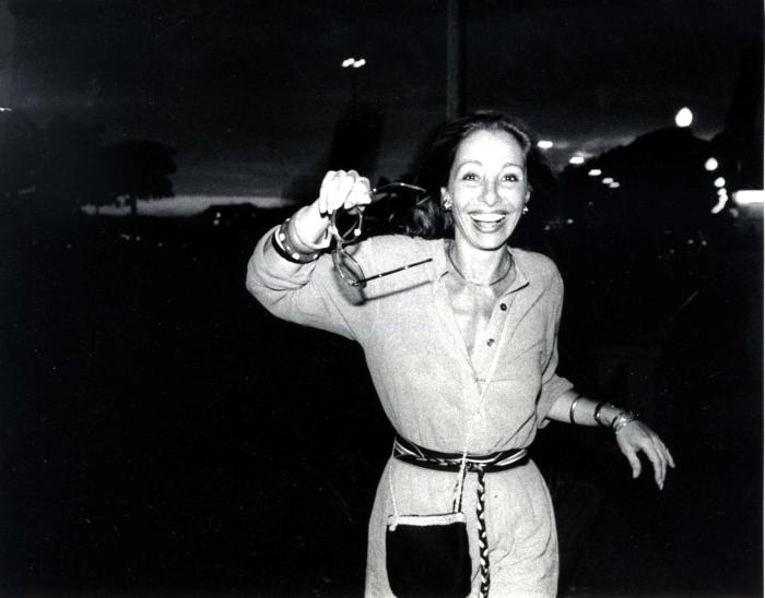
The graphic designer and art director Bea Feitler was born in Rio de Janeiro in 1938, a daughter of German-Jewish exiles. She showed an early love for art and illustration; her approving parents nurtured it, encouraged her to study at Parson’s School of Design in New York and set her on the path through which she would shape the look of the 60s and 70s, and revolutionise the meaning of a magazine. Wherever she went, people knew that she was coming by the bracelets jangling around her wrists.
Throughout her life Feitler thought about rhythm; about the flow of pages, about the beat, layers and corners of a city. Whether she designed for Harper’s Bazaar, Ms., Rolling Stone or Vanity Fair she’d mix up the things she saw in whirring, non-stop New York—high art and fashion, pop and ballet, politics and print—symbolising how things were mixed up and connected already. The freedom she was given at these publications allowed Feitler to renegotiate commercial representations, using magazines as a mass vehicle to address social change.
Feitler often used classic lines to break up pages—the kind of lines she’d find underscoring the title pages of antique books. She used them to interrupt text, to geometrically puncture vibrant organic shapes, to impose rhythm, but mostly she used lines to emphasise. To make space. To make meaning. With lines she said: This is important. Look. At. This.
Bea Feitler
In 1961 Feitler was pulled back to New York after a short stint at home in Brazil by an offer to work alongside one of her Parson’s professors, Marvin Israel, at Harper’s Bazaar. She soon became co-art director with Ruth Ansel; they were the magazine’s first female art directors and, both in their early 20s, by far the industry’s youngest. Ansel grew up in the Bronx, where her mother had run a small lingerie shop; she loved European café culture and the colours of De Kooning paintings.
For a time Ansel worked at Columbia Records, a label famous for inventive album sleeve artwork, before finding her way to editorial design. In the youthful pursuit of magnificence and provocation, Feitler and Ansel brought to Harper’s what they saw on the streets and felt in the air—the brightly-coloured dandyism of the newly emancipated young, the kaleidoscopic entropy of the shifting political and cultural landscape.
Feitler and Ansel worked together, learned from one another, shared new experiences and discoveries with each other—a long, liberated way away from the Mad Men narrative of women pitted against one another in the offices of the 60s. These speculative young women worked side by side. They laughed a lot and responded to the same opportunities and revelations—in the pages of Feitler’s scrapbook there are countless images of her and Ansel’s heads laid over awkward magazine advertisements, then photocopied to create a single document.
“Feitler believed totally in graphic design, how the flow of images and visual energy give vital shape and form to information.”
At Harper’s the two designers connected—or collaged—the cultural dots exploding around them. On glossy commercial pages motifs from pop songs collided with backgrounds inspired by op art they’d seen in Manhattan galleries; gestures that Feitler, the classicist, studied during ballet performances were paired with the fashions Ansel, the modernist, spotted musicians wearing in coffee houses in happening Greenwich Village.
In 1965, for a shoot with the boundary-breaking portrait photographer Richard Avedon, they dressed Jean Shrimpton in a NASA space suit, deftly illustrating how the raging space race of the time was shaping the cultural imagination. In a last-minute panic over the cover’s image not clicking, Feitler and Ansel snipped DayGlo tubes into the shape of an electric pink halo to frame Shrimpton’s enormous eyes and bee-stung lips; making one giant leap from a mere fashion photograph to a statement about the essence of the 60s, where reality and fantasy collided.

Bea Feitler art direction for Harper's Bazaar
In the same year Feitler and Ansel published Avedon’s series with the then-unknown Donyale Luna, the first black model to be featured in the pages of a major fashion magazine.
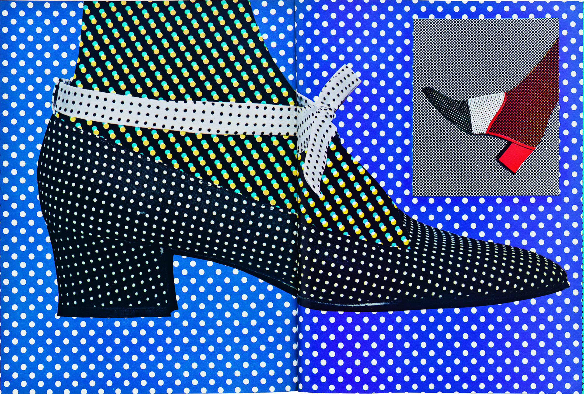
Most of all the pair worshipped and emulated cinema—they loved Avedon not least because he was the inspiration for Fred Astaire’s character in Funny Face—and the voluptuous carnival energy of Marcel Camus’s 1959 French-Brazilian Black Orpheus found its way to magazine spreads that pulsated with movement and dance. When commissioning the photographer Bill Silano to shoot a shoe portfolio, Feitler took him to see Claude Lelouch’s visually arresting, meta- romantic film A Man and A Woman six times. Shoes, after all, are an object of love.
At Harper’s Feitler forged close, intensely creative relationships with many photographers and brought some key revolutionary talents to the magazine: Avedon, Bill King and Diane Arbus, among others, became intimate friends. If they were the eyes, she was the brain and heart, connecting it together and helping to distribute their experimentation to a wider audience.
One day after work in Manhattan, Feitler met the representative of a large publishing company from Sao Paulo. They had a plan to publish a woman’s fashion magazine called Setenta, meaning “Seventies”, and wanted her to be its art director.
Around 1970, at the height of the country’s repressive military dictatorship, there was nothing like the freewheeling, intensely playful spirit of Harper’s for Brazilian readers. Loving a challenge, addicted to spinning multiple plates at the same time, and because she could see the political potential of a liberating fashion magazine in her home country, Feitler accepted the offer. Feverishly, she would work on Setenta at the same time as Harper’s—never letting on to the latter that she was working on the former, relishing the secret, even inspired by it. Concepts from one magazine would find their way into the other, and she’d send New York fashion photographers like Bill King to the South American beaches for bikini shoots.
This is how friends and family of Feitler suggest she liked things: she enjoyed being busy and didn’t want to miss out. She wanted most of all to be in two places at once, and this way she almost could. She pursued clear divisions in her life, deliberately drew the lines between people and places so that she could create and follow her own rhythm and be several things at once.

Bea Feitler spreads in Harper's Bazaar.
In 1972, Feitler left Harper’s and joined the activist, feminist and journalist Gloria Steinem to launch Ms. magazine—another exciting challenge. Steinem saw the potential in the celebratory vibrancy of a popular, young fashion magazine as designed by Feitler, believing it would activate Ms.’s more challenging content in an accessible and lively way. Controversial messages were made all the more powerful andeye-catching through Feitler’s witty design, and her visual intelligence helped the era’s uncompromising feminist topics to enter the mainstream.
Those working at Ms. during the Seventies remember her turning up in the morning—the clanking of her bracelets audible long before she entered the room— coming straight from a long night at Studio 54. In Feitler’s albums from the period, there’s a photograph of her leaning over to kiss Andy Warhol’s hand, placing her at the very centre of the New York scene.
One of Feitler’s most memorable covers for Ms. combined a gaudy green and pink DayGlo colour scheme straight from a classic Warhol with the provocative punch of a Steinem protest placard. Celebrity exuberance was spliced with the urgency of protest, another sly observational summary of the conflicting currents of the period. The Christmas special’s cover was entirely typographic—defying the conventional wisdom that all-type covers are disasters at the news- stand—declaring “Peace on earth good will to people,” revising with feminist guile the biblical scripture. It sold out its run in December 1972, and Ms. followed up with a neon-sign version a year later.


1972 cover for Ms. magazine and inside spreads by Bea Feitler
Feitler constantly shook things up, swapped things around and supported those she believed in by bringing them along with her in each direction she pursued—fluidly moving from politics to fashion, music to art, counterculture to the mainstream. She had asked a young Annie Leibovitz to shoot for Ms.; the start of a fiercely collaborative friendship. Leibovitz then took Feitler to Rolling Stone in 1977, where the art director began to consult and then became design director. Feitler then took Leibovitz to Vanity Fair, convincing her that she would find more opportunities there. The photographer’s move into fashion and celebrity photography changed her life. Leibovitz looked upon Feitler as a vital mentor.
The first edition of the all-new Vanity Fair appeared after her death in 1982, aged 44; she had surgery twice for a rare form of cancer, which she hid from those around her and masked with stylish turbans. No one at Condé Nast knew she was ill. As always, Feitler gave her all and finished the prototype before she died. Vanity Fair was described as her swan song—the last act of the last great art director.
Feitler believed totally in graphic design, how the flow of images and visual energy give vital shape and form to information. She wanted modern culture to look like it was already classic—of the moment, but also apart from it. She saw designers not as invisible, functional guides, but as a singular blend of authors and artists. Documenting and decorating, explaining and exploring, creating the stage upon which everything performed. A dancing figure, a pop-art shoe, a political message, a woman kissing herself in the mirror; all reinforced by Feitler with a definitive line, a persuasive elegance and, ultimately, a love of life.

Bea Feitler cover for Vanity Fair.

Bea kissing Andy Warhol's hand.
This feature originally appeared in Riposte #9.